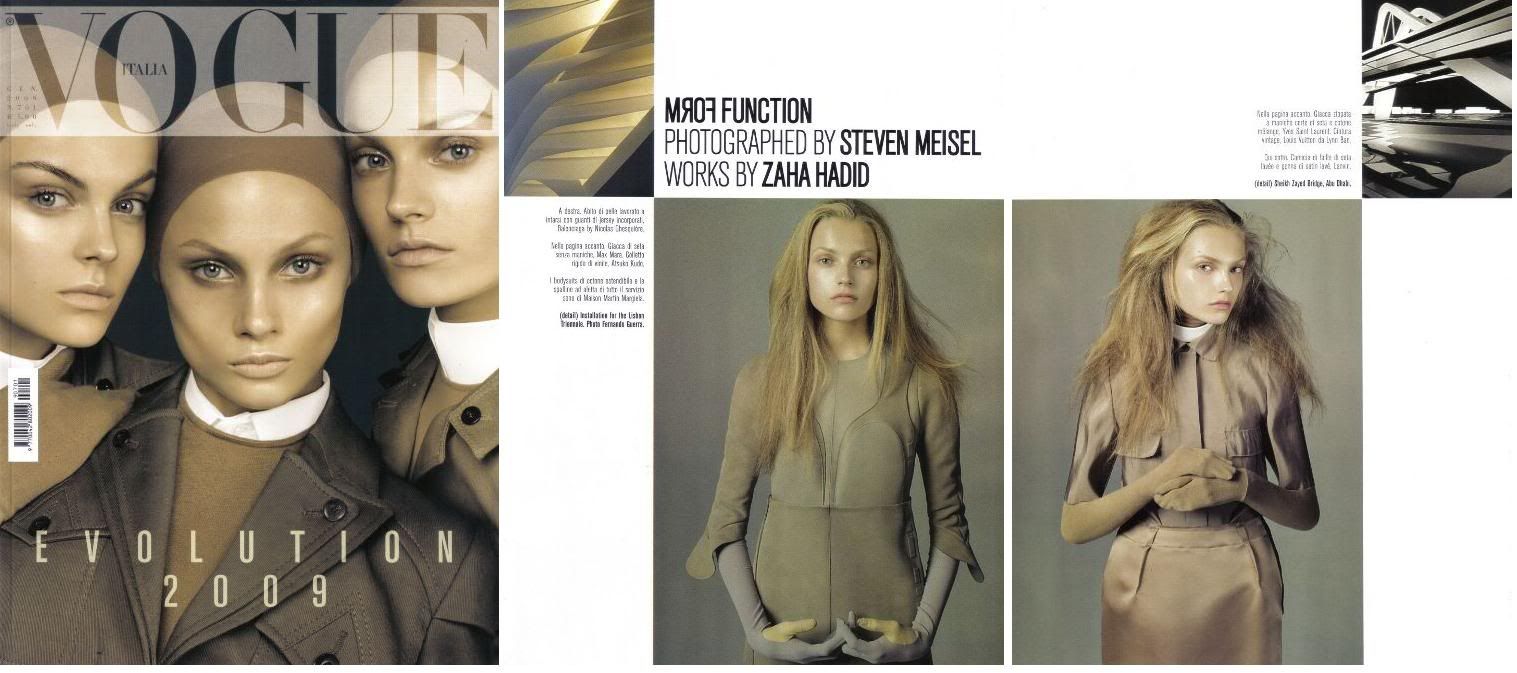
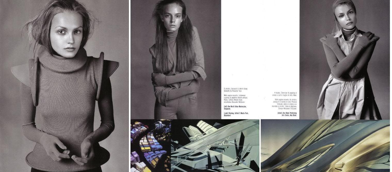
The architectural works are by Zaha Hadid. I'm not really a Zaha Hadid fan, but I guess her works go well with this editorial. (If you don't know who she is, she designed the Chanel Mobile Art Pavilion, I included a picture on the bottom of this post).
The cover is great (take note US Vogue!), the colours are simple and it makes the editorial so clean, just the way I like it.


Pictures from foto_decadent
Be sure to check out the rest of the pictures on foto_decadent!
Here's the Chanel Mobile Art Pavilion by Zaha Hadid:

Picture from Zaha Hadid Blog


17 comments:
i think your right. the editorial does really match Zaha Hadid's work.both are breath taking. really like that cover of the vogue italia.
muah x
marian
The editorial is beautiful.
WOW! I love it. I think I'm gonna have to go to the store and buy a copy!
Very futurist !!
Wow, I agree that that's one gorgeous cover! Incredible editorial too! :)
xx
what a lovely cover!
those pieces are really fantastic. of the space age.
Love the colors, and the cover is great! I rather like the clothes too! :)
Thanks so much for your sweet comment, dear! <3
xoxo,
S-C
their faces are too amazing for words to express!
thanks for the add :) i'll add you right back dear! and thanks for your kind comment too! lovely lovely!
xxx lM
I can't get over how incredible this is... stuning!!!
xxx
vogue italia is so esthetically beautiful
stunning photographs. i love it when they keep it simple.
I should pay more interest to architecture now. That Zaha Hadid building is .. wow
so beautiful.
xx
Italian Vogue just never gets it wrong. Stunning and creative.
I really need to get hold of Vogue Italia.
im kinda sorry that kinga is not on the cover as well.
Post a Comment